White paint. Simple. Classic. Elegant. An easy choice. Or so you thought. White paint is the chameleon of colour and that’s because it reflects light and can change from room-to-room. What starts out as an easy choice, often leaves our customers more confused than when they started. That’s why we put together this guide as a starting point for anyone at the beginning of their white selection journey.
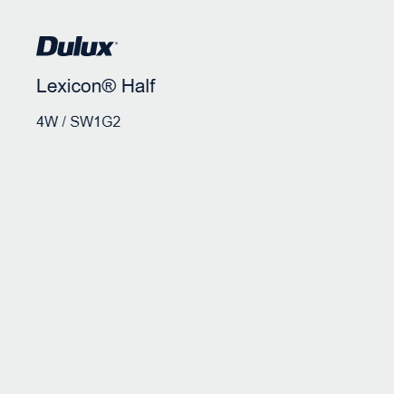
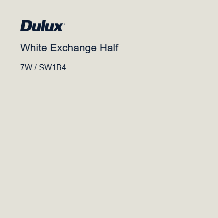
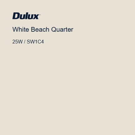
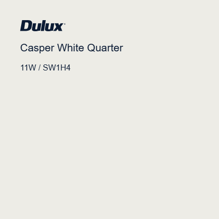
White paint, as all paint, has different undertones; warm, cool and neutral. Understanding this is the first step in deciding which path you go down next. Below is an example of Dulux’s most popular whites, and for good reason.
Cool Whites

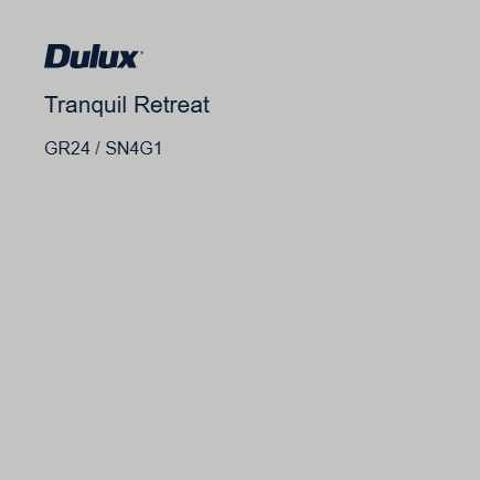
If you’re looking for a shade of grey to pair perfectly with these whites, Dulux Tranquil Retreat is a winner.
Warm Whites

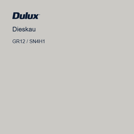
The perfect shade of grey to complement a warm white is Dulux Dieskau. Bonus points if you can pronounce this one!
Neutral Whites


Things to consider when choosing the perfect white for your space:
Hard Finishes
This might be a phrase you’re not so familiar with, but this is the umbrella term for anything that can’t moved or replaced, at least not without ease and a big budget. Things like, flooring, countertops, tiled splashbacks, ceiling beams and the like.
Understanding the undertone of these finishes will help steer you in the direction of cool or warm whites.
Hard finishes that are warm could include medium-brown wood floors, earthy toned tiles, countertops with warm flecks or veins, etc. Warm tones are often suited in more traditional heritage style homes.
Cooler toned finishes like slate flooring, gray toned floors, carrar marble are all friends with cooler shades of white. They also pare well with neutral shades of white.
Testing Colour
Sample pots are the best way to test colour in your home and the clearest way to see if the undertone you’ve selected in-store works in with the hard finishes and soft furnishings in your space. Another thing to remember is paint colours in a colour card, paint chip and digitally on screens will always look different to the real deal. Sample pots are your safest bet and the only way you can get a true example of a colour. Skipping this step could see you selecting the wrong shade of white.
Lighting
All paint colours are effected by light. Some spaces are flooded with natural light and others are in short supply. Fluorescent light can create a wash-out effect, whilst lamps and lighting all come with both warm and cool tones too. These all impact the shading of your white paint and how they show up in your space.
At the end of the day, selecting colour, any colour, is something we strive to get right. Don’t overcomplicate it, test your colours and stick to what’s popular. They are popular for good reason.
If you're ready to start your next paint project, make sure you aren't making these painting mistakes.
Head to your local Inspirations Paint store to get expert colour advice for your next project.